Advent of Code is back! Unwrap daily challenges to sharpen your Alteryx skills and earn badges along the way! Learn more now.

Alteryx Designer Desktop Discussions

Find answers, ask questions, and share expertise about Alteryx Designer Desktop and Intelligence Suite.
SOLVED

Bar chart to represent product information over time

jmd25
7 - Meteor

Hi All


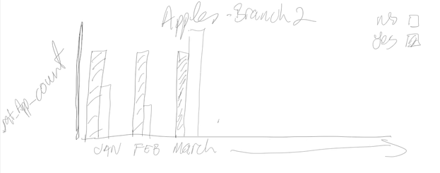
I am trying to create a bar chart per month/year to represent the count of a binary value on each sale of a product. For example, if you have apples, was it sold with or without VAT. My input data looks similar to the below:


Year

Month_Year

Branch_Number

Product

Month_Year

Sold with VAT

Sold with VAT Count

2023

2

1

Apples

2023-2

YES

2000

2023

2

1

Apples

2023-2

No

100

2023

2

1

Oranges

2023-2

YES

4000

2023

2

1

Oranges

2023-2

No

51

2023

2

2

Apples

2023-2

YES

1000

2023

2

2

Apples

2023-2

No

5

2023

2

2

Oranges

2023-2

YES

6000

2023

2

2

Oranges

2023-2

No

72


I am looking to present the information similar to the image below (apologies for the crude drawing). I may also need to represent the same information, but for all branch's in a similar dashboard, but not sure space will allow this.
 

Product_Branch.png


Really appreciate any guidance on this. Have been playing around with setting all morning, and just cant seem to figure out how to get what I want. Sure it is probably something simple I am missing.


Thanks in advance,


4 REPLIES 4
Christina_H
14 - Magnetar

There are a couple of chart settings that will get you what you want.


Create your layer as a bar chart with month/year on the x-axis and the count on the y-axis.

image.png


Then split by VAT

image.png

This gives you the double bars for with/without VAT.


Then you want batched charts, grouped by branch and product

image.png


Final output:

image.png

jmd25
7 - Meteor

Thats brilliant, thanks for that. That did the trick. Small bug happening though. For the most part similar to your diagram, Blue=Yes and Orange=No. however it seems to change periodically across some graphs. Has caught be out on analysis a bit. Any idea what might be doing this?

Christina_H
14 - Magnetar

Where the colours change, is it because one of the options is missing?  It might be worth making sure both yes and no are always present, and maybe sorted in the same order.

jmd25
7 - Meteor

That must be what it is. Not all entries would have a Yes / No entry. Thanks again, that was wrecking my head. 

Labels